
Berkey Water
Solutions


Title
Branding
Date
2024-2025
Berkey U.S.A needed an updated identity due to an oversaturated market with water brands that struggle with unique looks.
My goal in this project was to create an updated modern identity for Berkey with a different approach to the concept of water.
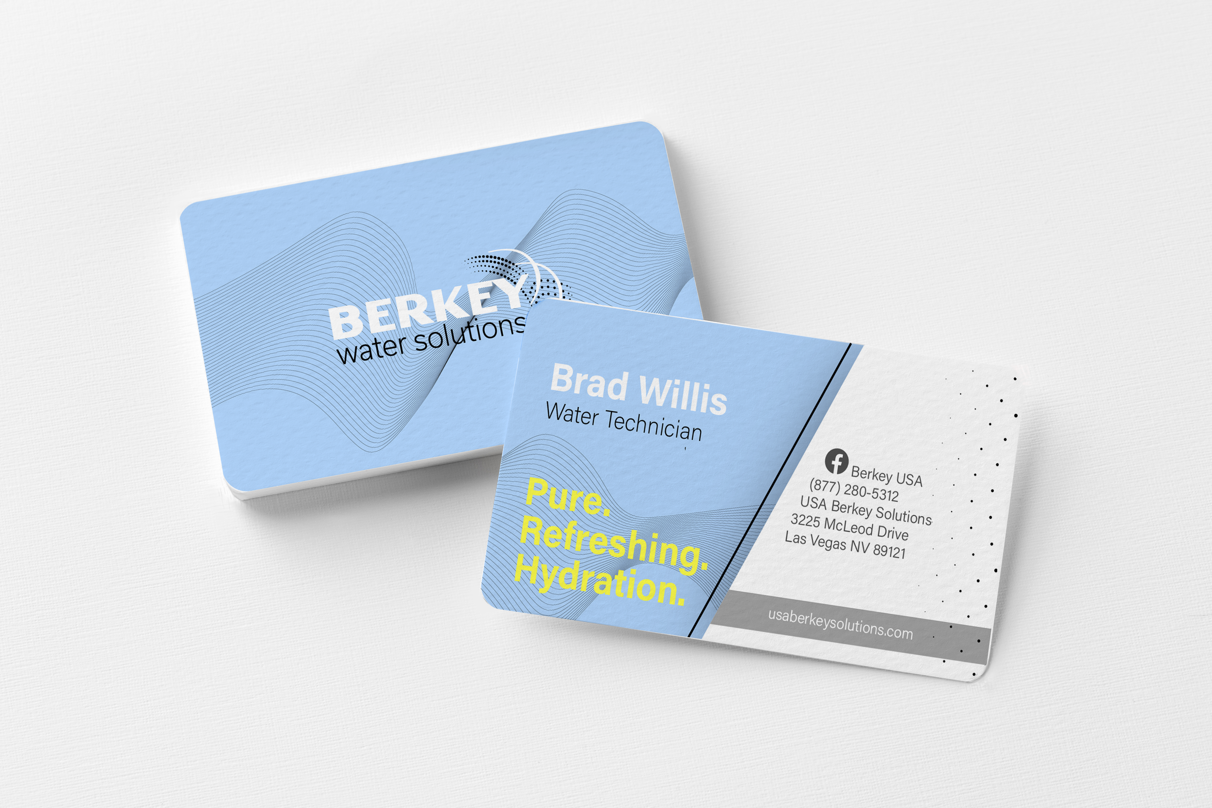
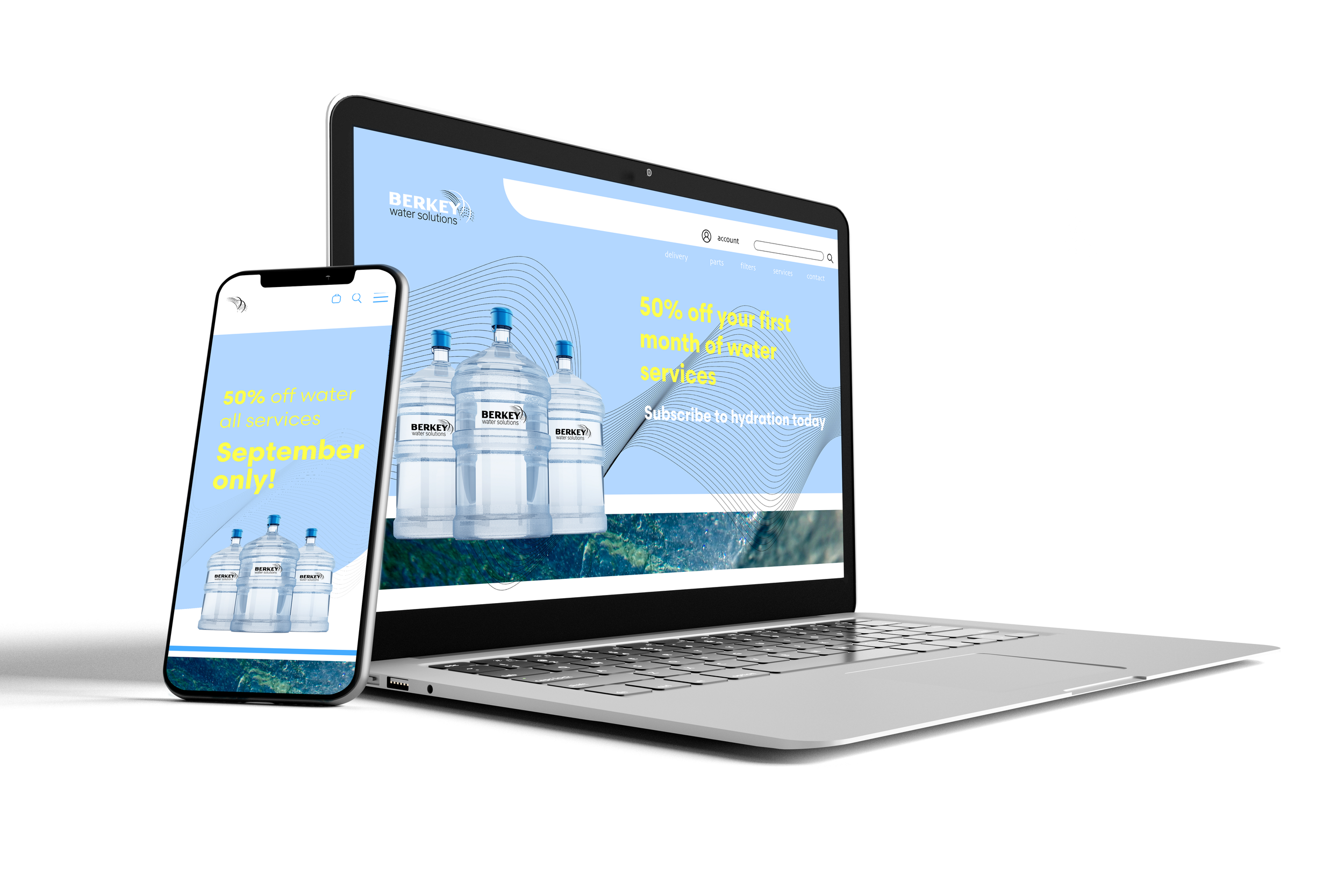
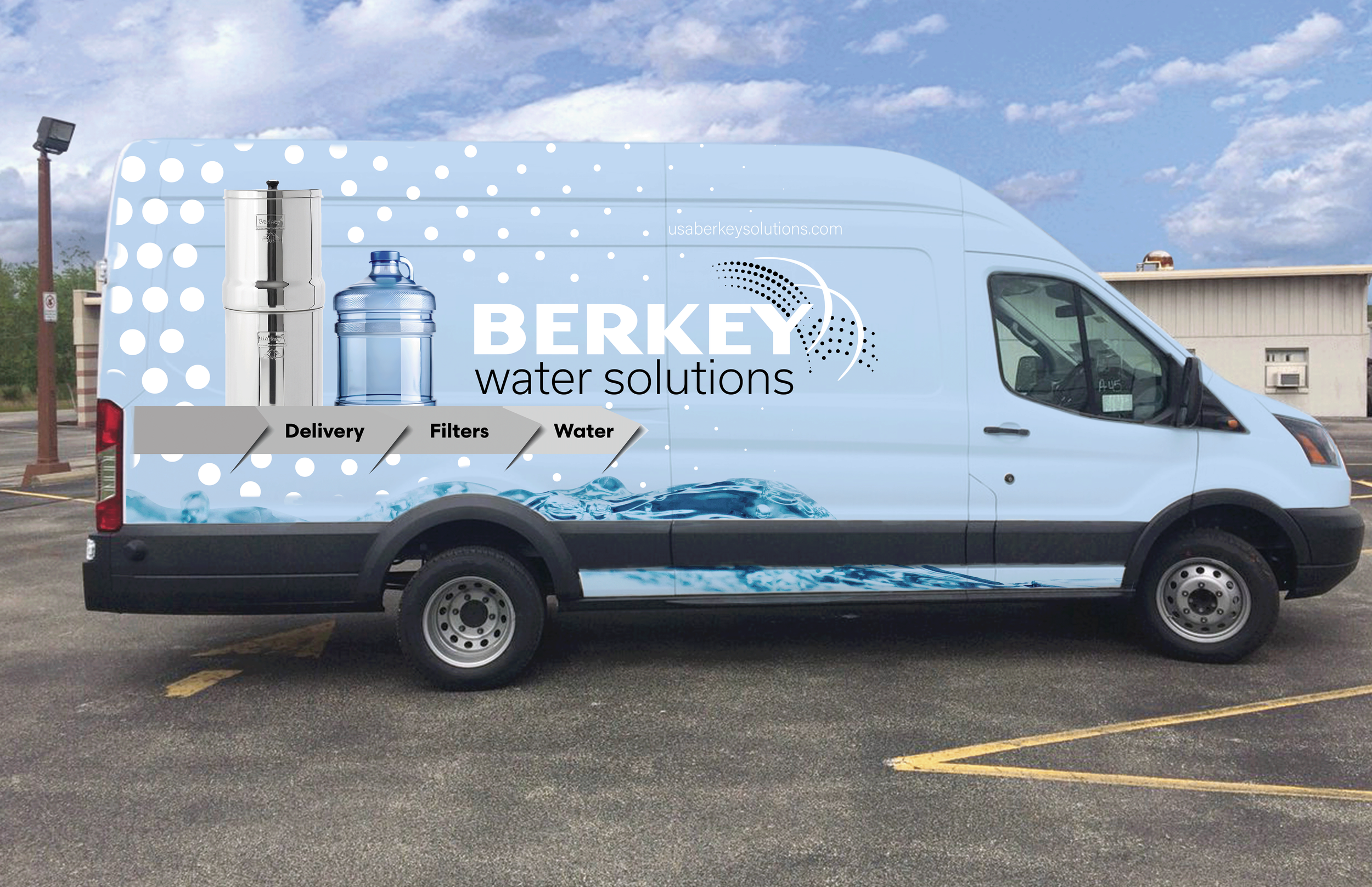
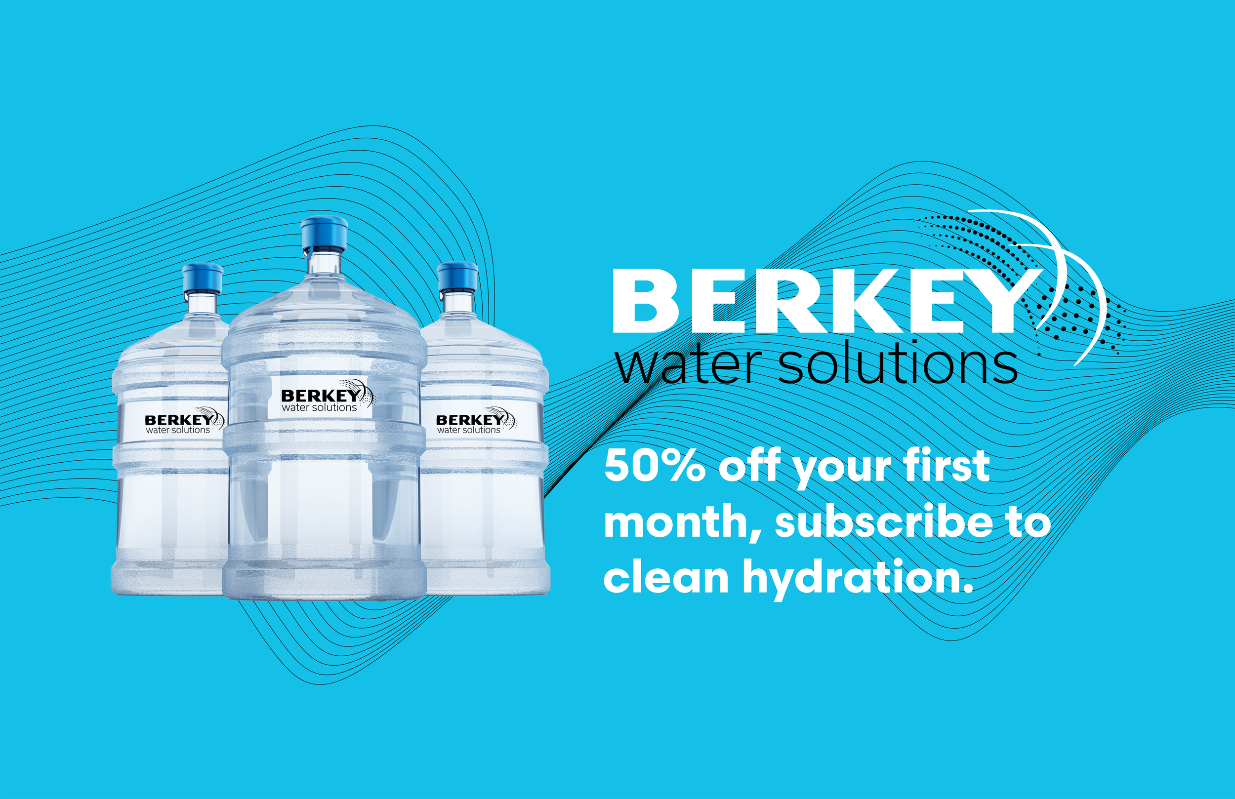
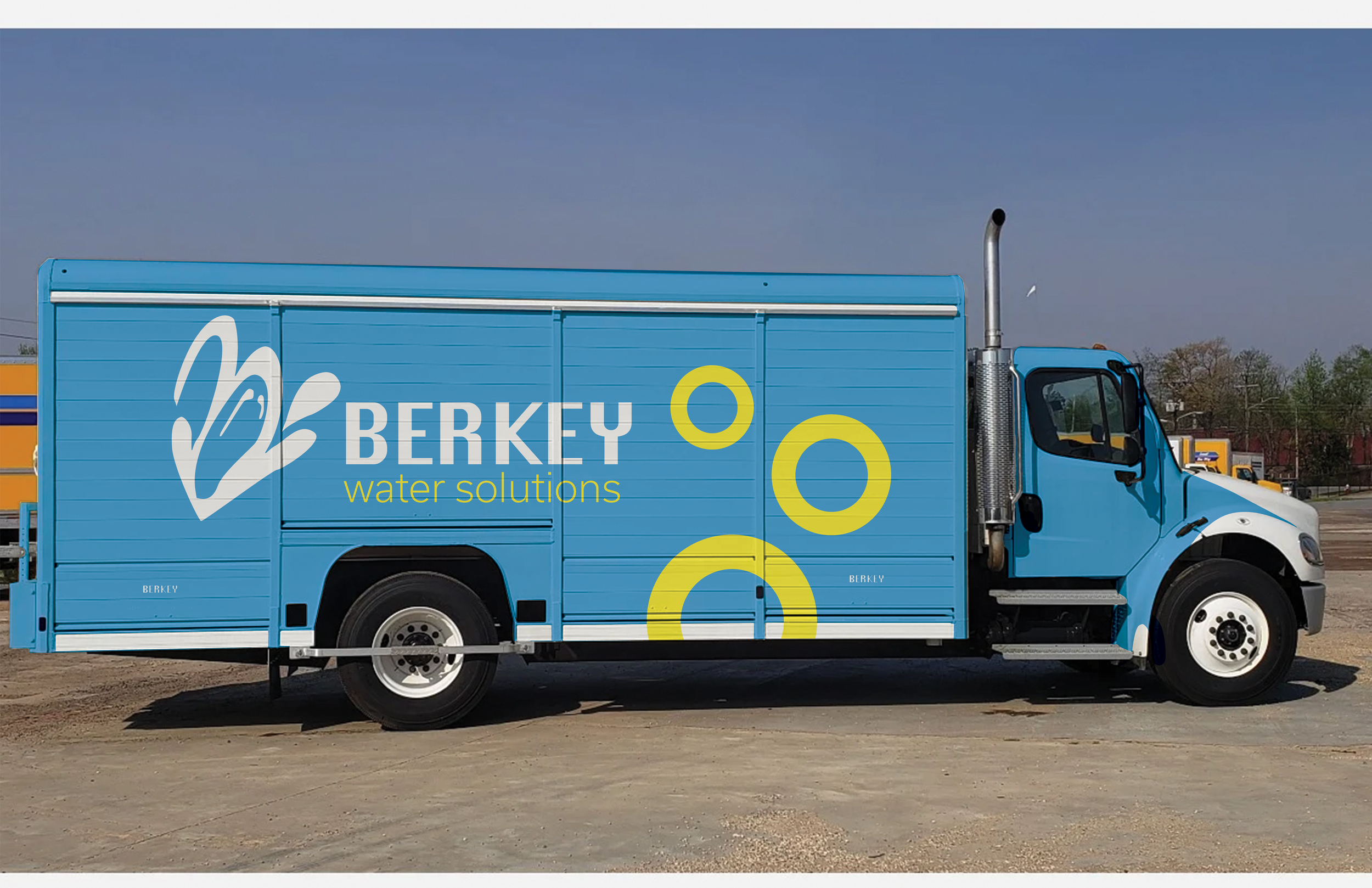
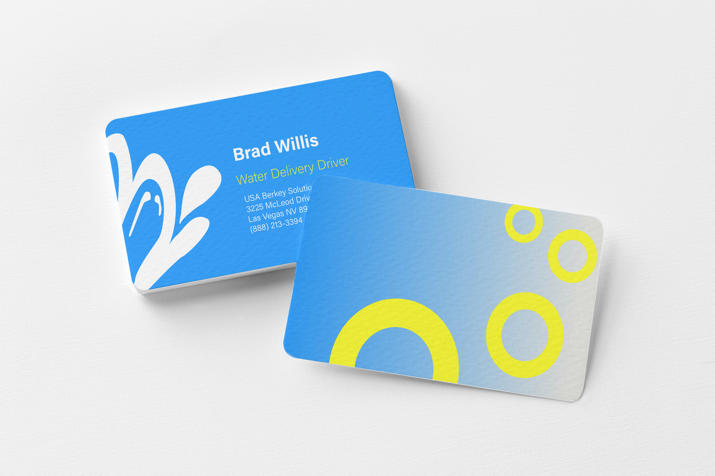
A rebrand consisting of clean, bright, and simple tones of color was developed which included accents of a vibrant yellow which would influence feelings of pureness and energy which people look to when searching for unique water brands.
In this project…
Process
The rebrand was created by looking at competition to see common themes, and to develop new visuals that haven’t been explored yet, and then create concepts for colors, sketches for logos, and gather information about what the purpose of a water company is and how to create unique services for a new wave consumers and audiences.
A unique way of thinking about water filters was customization and the concept of having costumers have the ability to customize the appearance of their filter and the jug of water they order. Every office and home that has a filtered water system struggles with filtering systems that stand out or don’t match their home decor. By conceptualizing this idea, people could now have filtered water stands that match their wall color, or furniture and fit the style that they want.
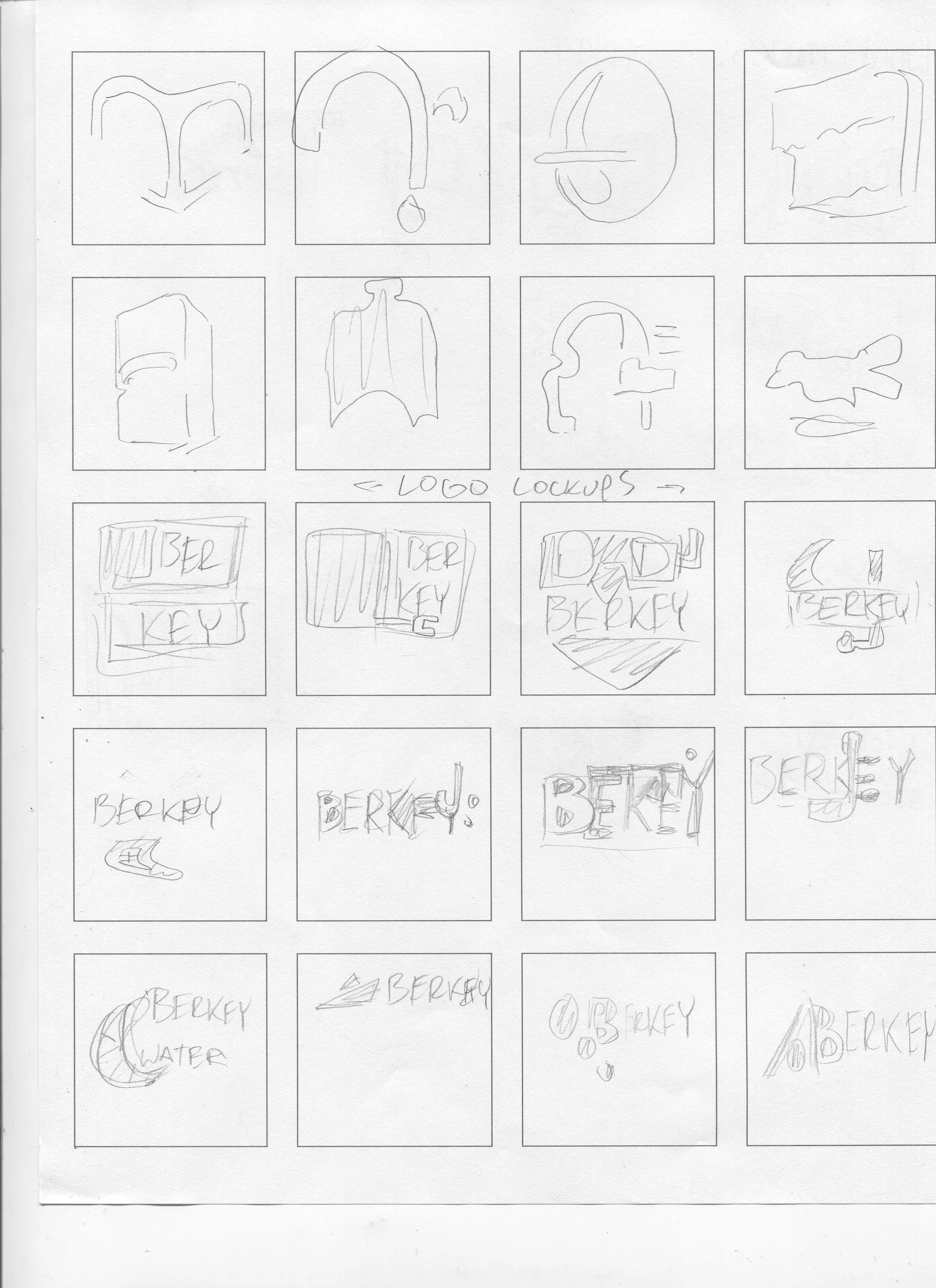
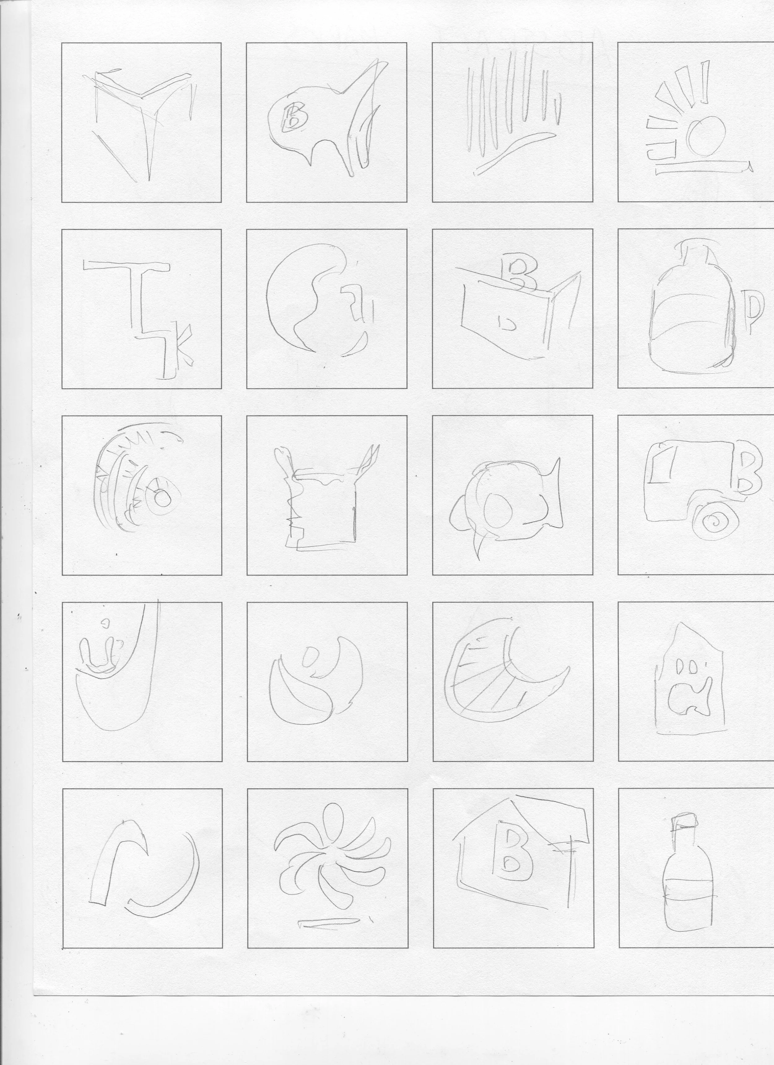

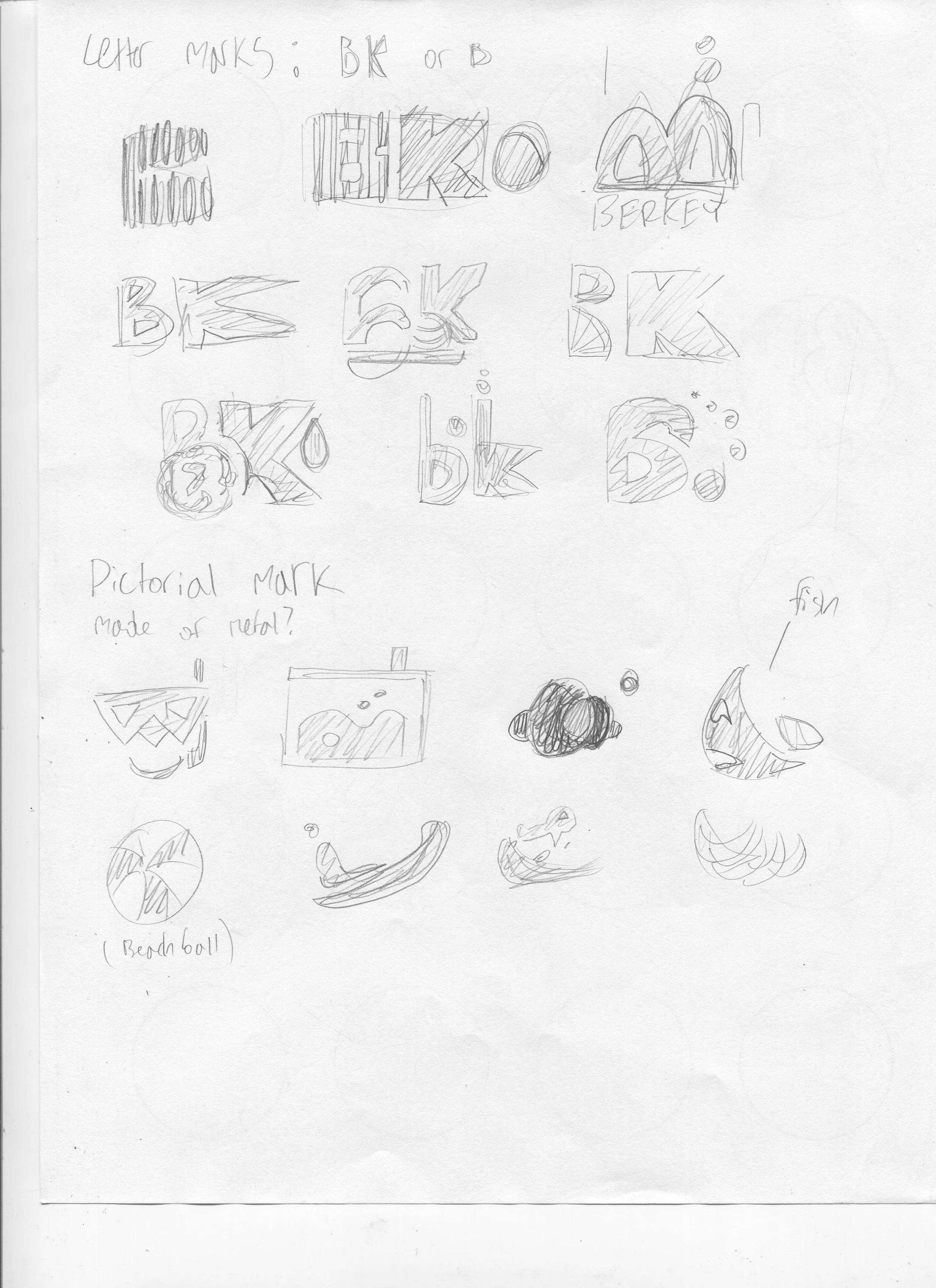
Revisions
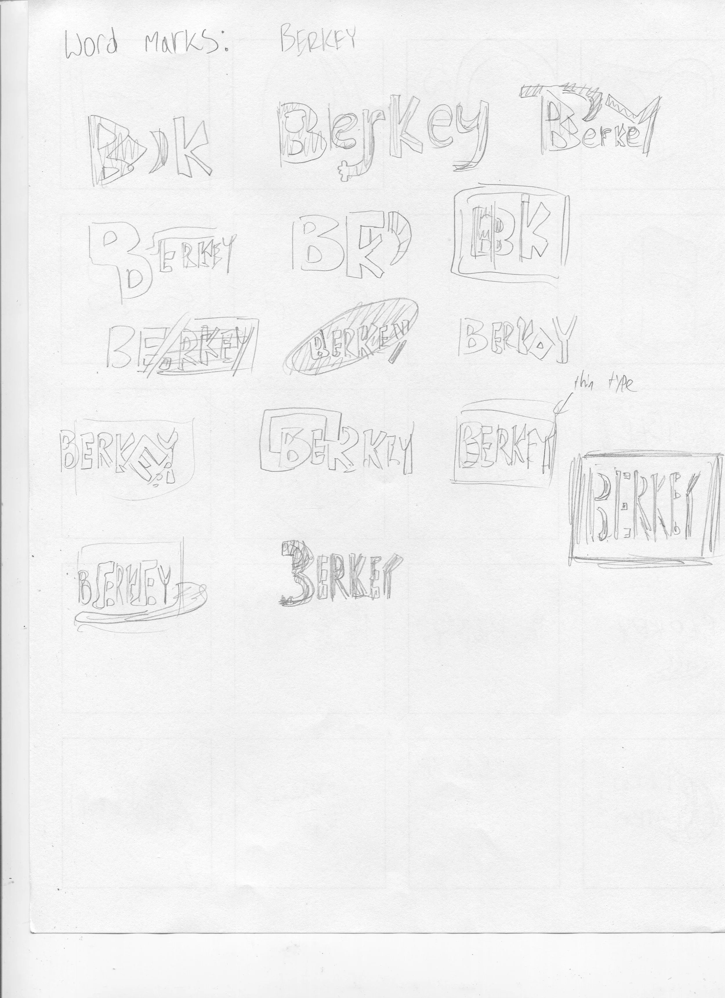
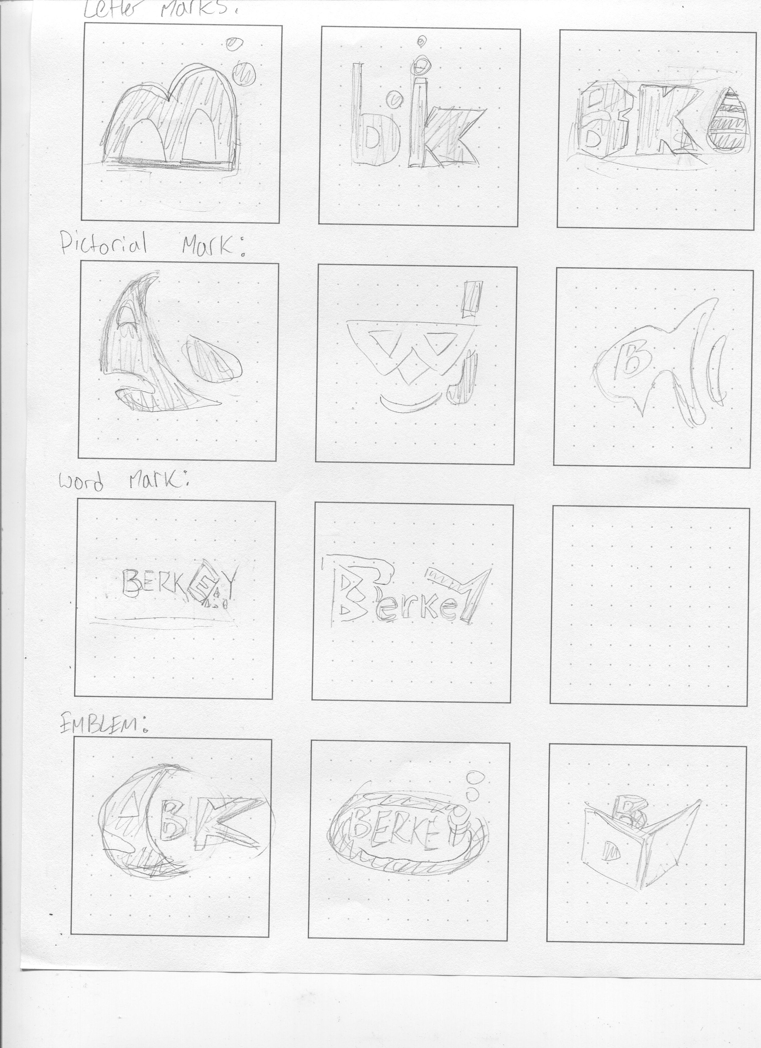
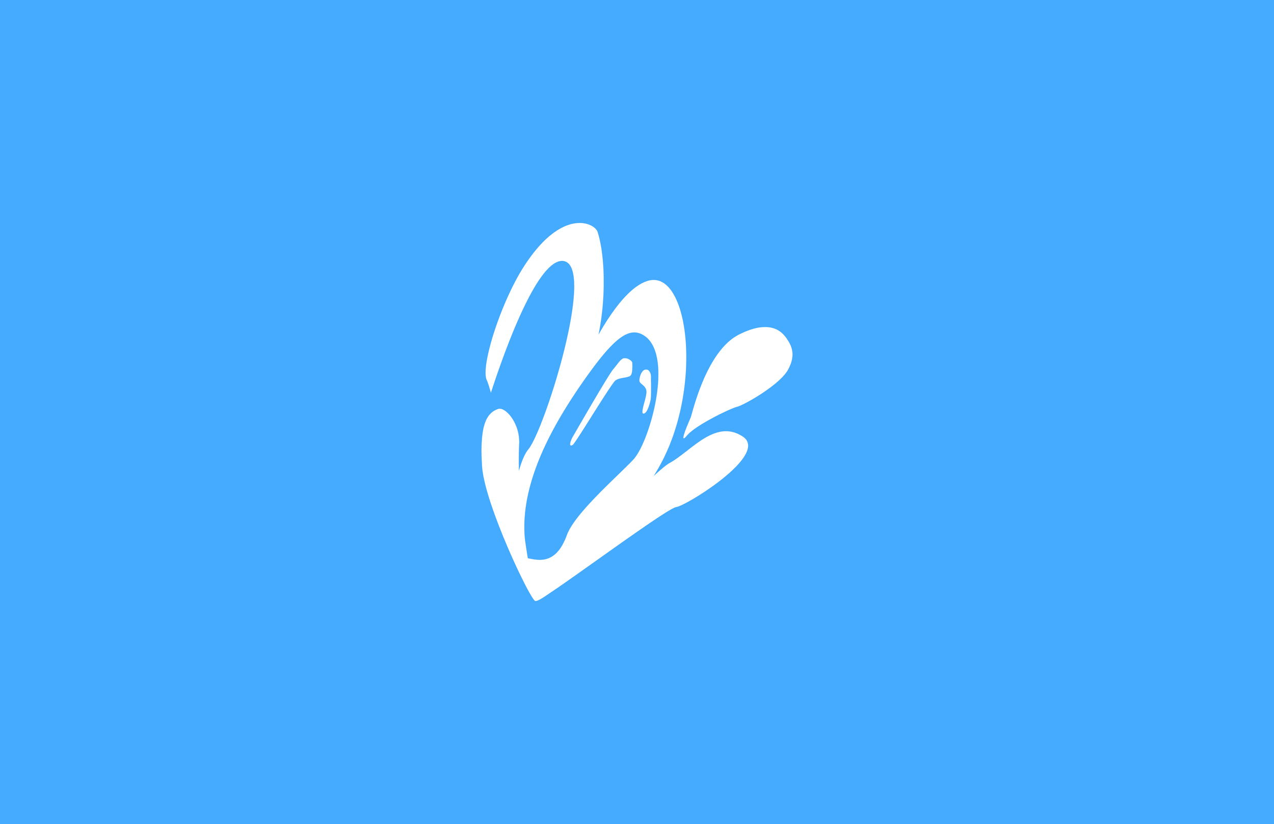
The rebranded logo was first developed into a ‘B’ lettermark which stood for Berkey. The logo did look very modern and energetic with the imagery of the water rising out of the symbol but overall what needed to be developed was a more professional looking rebrand that felt more clean and also was more unique.
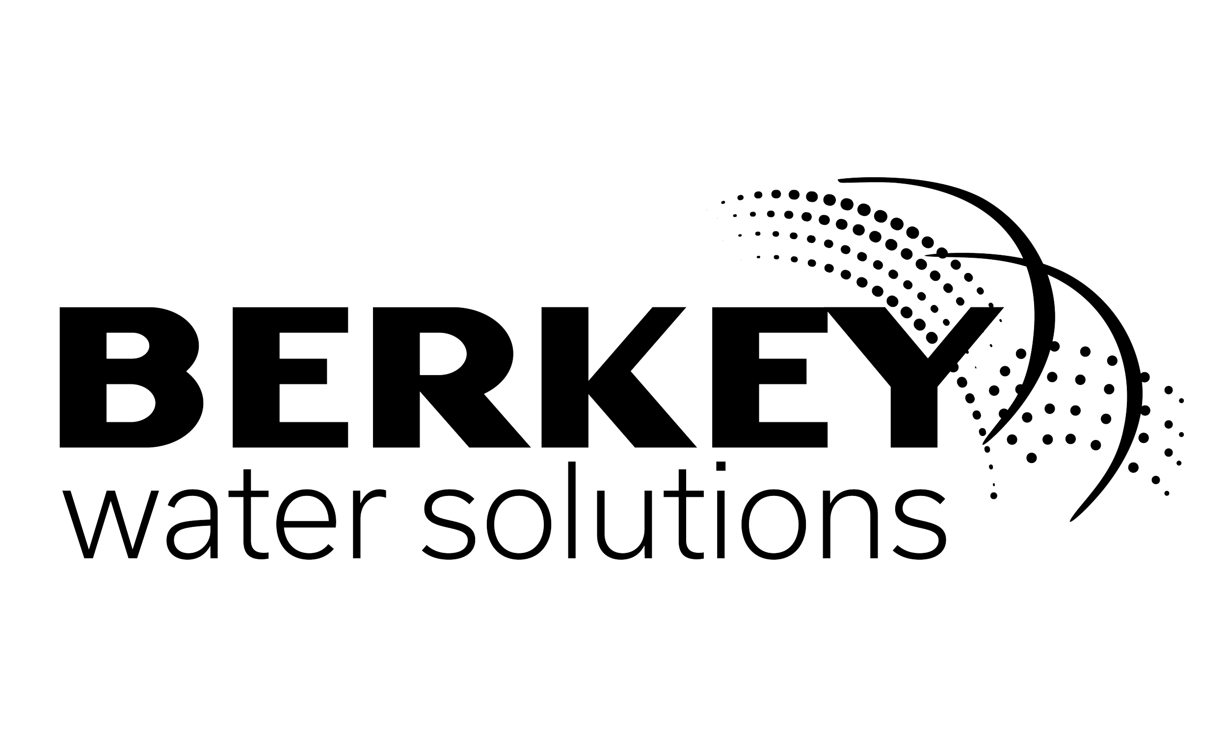
Feeling that the logo was not unique enough, more ideas were concepted to see how water could be further abstracted and how that feeling of flow and healthiness could be pushed further. The solution was solved by using patterns of dots which gave the exact visuals that I wanted.
Some early concepts of the logo can be seen on the left where the two half circle strokes represent the lettermark of the ‘B’ being totally abstracted.
Variations of the logo


See more of my work.
-

Internet Traffic Infographic
How much time during your life do you spend on your phone or computer compared to other tasks? This project is an infographic showing statistics about the rise of internet traffic and all things about the internet.
-

Evolution Typography
To concept a design for a car wrap sometimes you need additional graphics. This project was all about developing an alphabet tailored to be wrapped onto a project car and make it really stand out.
-
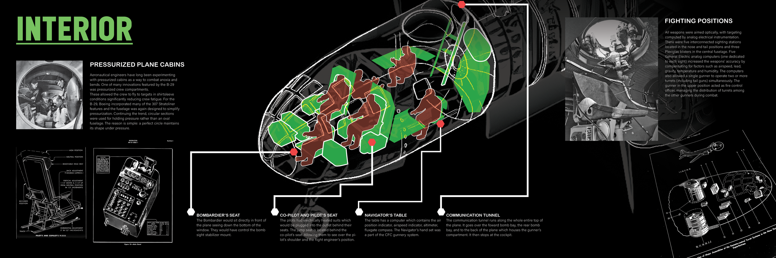
Smithsonian Interactive Exhibit
During 2024, the B-29 bomber was added to the cluster of aircrafts at the Smithsonian Air and Space Museum. This project shows all digital screens installed along with the physical plane in the exhibit.