

Internet
Traffic
Infographic

Title
Publication Design
Date
2024
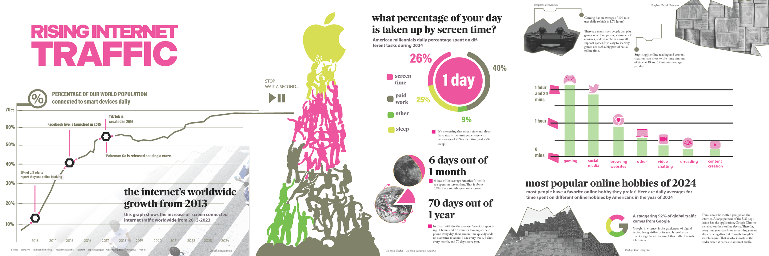
For this personal assignment, I developed a conceptual series of three infographic panels, each featuring a distinct graph. The project required in-depth research to ensure that each visualization was both accurate and meaningful. The central theme focused on the increasing amount of time individuals spend on the internet, highlighting the significant rise over recent years. A key objective was to effectively communicate the scale of this trend through compelling visuals, with the aim of leaving a lasting impression on viewers and encouraging critical reflection or action.
In this project…
Process
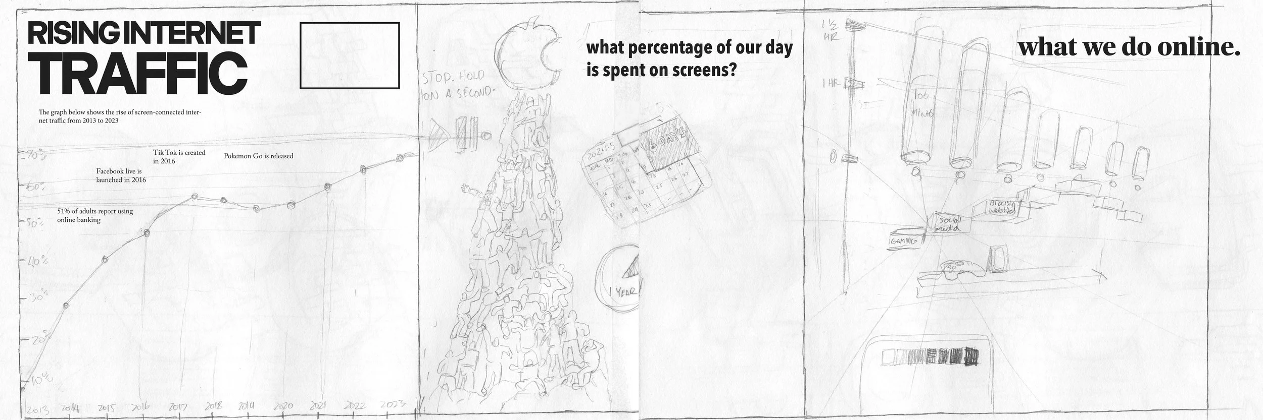
Developing the color system, infographics, and graphic elements was a vital part of this project. The process included a detailed, step-by-step refinement of each visual, gradually evolving the infographic into its final, polished form.
The objective was to design three distinct infographics, each built upon data sourced from reputable outlets. Every graph demanded thoughtful research and creative synthesis of information to create engaging and visually compelling outcomes. Some graphs incorporated custom icons to enhance clarity and visual interest, contributing to a more dynamic presentation overall. One of the standout pieces is the infographic featuring figures reaching toward the Apple logo, which illustrates the breakdown of daily activities and how much of our time is consumed by various tasks.
To emphasize the overwhelming amount of time the average person spends on screens, pie charts were used to create a visual comparison between screen time and other daily activities, such as sleep. The data becomes particularly impactful when these segments are combined, highlighting just how much of the day is devoted to passive digital engagement.
The use of icons added an element of familiarity and approachability, visually representing platforms or activities that viewers can immediately recognize and relate to.

See more of my work.
-

Internet Traffic Infographic
How much time during your life do you spend on your phone or computer compared to other tasks? This project is an infographic showing statistics about the rise of internet traffic and all things about the internet.
-

Evolution Typography
To concept a design for a car wrap sometimes you need additional graphics. This project was all about developing an alphabet tailored to be wrapped onto a project car and make it really stand out.
-
Smithsonian Interactive Exhibit
During 2024, the B-29 bomber was added to the cluster of aircrafts at the Smithsonian Air and Space Museum. This project shows all digital screens installed along with the physical plane in the exhibit.